
You check your WordPress site on your laptop and the page loads in under two seconds. You pull out your phone, and the same page takes seven seconds or more. The layout jumps while the page loads. Buttons take a beat before they respond to your tap.
This gap between desktop and mobile ranks among the most common complaints WordPress owners bring to developers, and among the most misunderstood problems in web performance. A WordPress site slow only on mobile fix rarely means starting over. In most cases, the fix lives in five or six specific settings, and you will find them without hiring anyone.
This guide covers why the gap happens, which parts deserve your attention, and the exact steps to close the gap, plus a few points most WordPress speed guides skip.
Why Your Site Runs Fast on Desktop and Slow on Mobile
Google tests desktop and mobile pages under different conditions, and the difference explains part of your score gap before you touch a single setting.
The desktop version of Google’s PageSpeed test runs on a fast virtual machine over a simulated broadband connection. The mobile version runs on a simulated mid-range Android phone with the processor slowed down, and the connection throttled close to a weak 4G signal. A script running in 100 milliseconds on the desktop test takes close to 400 milliseconds under the mobile simulation.
A 20 to 30 point gap between your desktop and mobile PageSpeed score counts as normal for most WordPress sites. A light brochure site might see a 10 to 20 point gap. A store built on Elementor or Divi, with a slider, a chat widget, and a few tracking scripts, often sees a 30 to 45 point gap, given how much work those tools ask a phone’s processor to do.
The gap turns into a real problem once the numbers grow beyond this range. If your desktop score sits at 90 and your mobile score sits below 40, or your mobile score trails far behind similar sites in your niche, something on your site adds weight a phone struggles to process quickly. This is the version of a WordPress site slow only on mobile fix worth spending your afternoon on.

The Real Causes Behind a Slow Mobile Site
Oversized images sit at the top of nearly every WordPress site slow only on mobile complaint developers hear, so start there before touching anything else.
Oversized Images
Images cause more mobile slowdowns than any other single factor. WordPress supports responsive images through the srcset attribute, which lets a phone request a smaller file than a desktop browser would. Page builders often skip this feature. A slider or a background image inserted through Elementor or Divi frequently ships the full desktop size to every device, including a phone with a 390 pixel wide screen.
Open your media library and check a few recent uploads. If a photo weighs over 500KB, compress the file before anything else. Tools like ShortPixel or Imagify handle compression inside WordPress, and converting to WebP or AVIF typically cuts file size by a quarter to half without a visible quality drop.
Render Blocking CSS and JavaScript
A typical WordPress page loads between 15 and 25 separate CSS and JavaScript files before anything appears on screen. Each file forces a round trip to the server. On a fast desktop connection, the delay barely registers. On a mobile network, those round trips stack into two to four seconds of waiting before a single pixel shows.
A caching plugin that combines, minifies, and defers non-critical scripts closes most of this gap in a few clicks. WP Rocket, LiteSpeed Cache, and FlyingPress all handle the job well.
Heavy Themes and Page Builders
Elementor, Divi, and WPBakery make design easy, but the convenience comes with a mobile cost. These builders often load the CSS and JavaScript for every element on a page, even elements hidden on mobile. A desktop-only slider still ships its script to a phone. The slider stays hidden through CSS, but the phone already downloaded and parsed the code behind the slider.
Sites built on lighter themes like GeneratePress or Kadence, paired with native WordPress blocks instead of a heavy builder, consistently score better on mobile, since less code hides in the background.
Third Party Scripts
Every chat widget, marketing pixel, and analytics tag adds a script your visitor’s phone has to download and run. A single tool like Intercom or Drift adds 200 to 500 milliseconds of blocking time on its own. Stack a Facebook pixel, Google Analytics, a cookie banner, and a pop-up on top of a chat widget, and a phone spends over a second processing scripts before the page responds to a tap.
You do not need to remove these tools. Set them to load after the page turns interactive instead of before, and check whether every page on your site truly needs the chat widget or the pop-up.
Hosting
Shared hosting puts hundreds of sites on one server. When another site on the server spikes in traffic, your response time slips too. A slow server response adds delay before a phone even starts downloading your page, and mobile users feel the delay more than desktop users do, since a mobile connection already runs slower.
Font Loading: The Fix Most Guides Skip
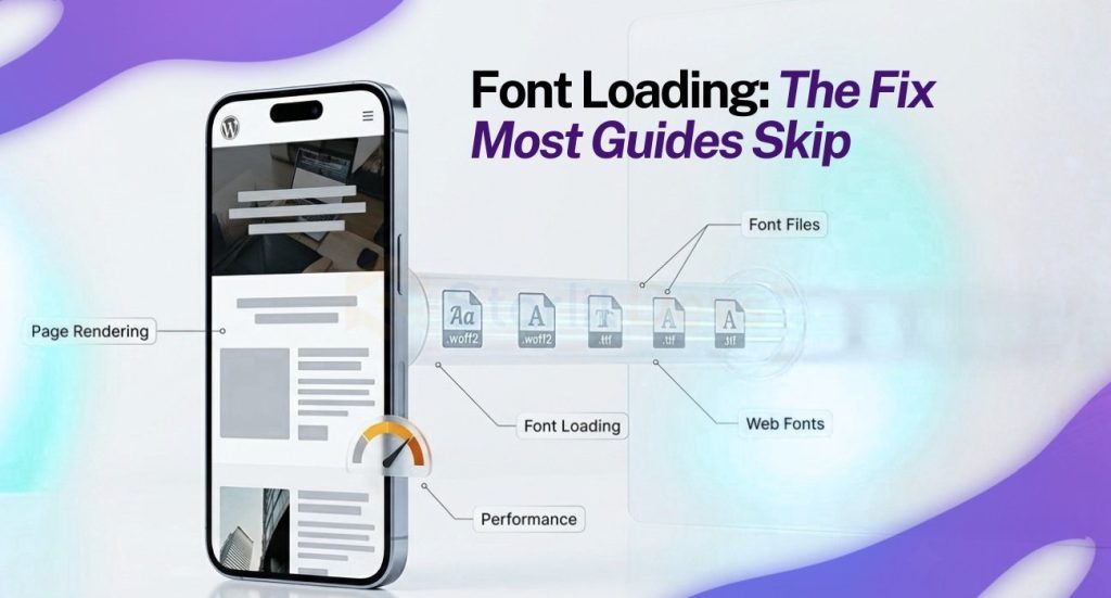
Font loading quietly drives a WordPress site slow only on mobile score down more than most owners expect, and almost no speed guide covers font loading in depth.
When your theme pulls fonts from Google Fonts or another outside source, the phone connects to the outside server, downloads the font file, and only then renders your text. Some setups hide all text until the font finishes downloading, a problem developers call a flash of invisible text. On a slow mobile connection, this shows up as several seconds of a blank page before a single word appears.
Three changes fix the problem quickly. Set font-display: swap in your CSS so the browser shows text in a fallback font right away and swaps in your custom font once ready. Self-host your font files instead of pulling from Google’s servers, which removes an extra connection your phone has to make. Limit yourself to two or three font weights instead of loading regular, bold, italic, and bold italic as four separate files.
Three Fixes Most Articles Never Mention
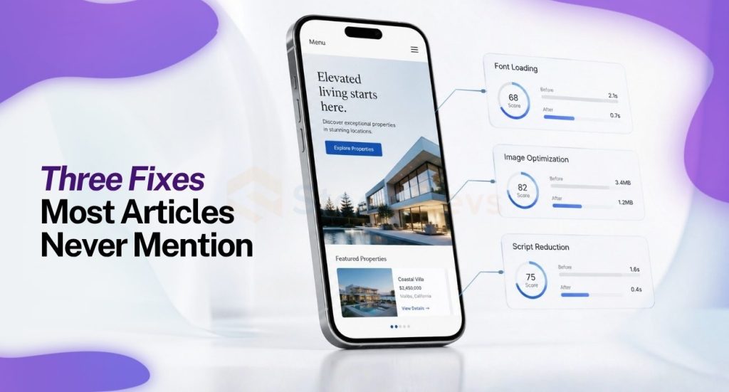
These three overlooked settings explain a surprising share of every WordPress site slow only on mobile ticket a developer opens, yet almost none of the popular guides cover them.
Check Your Viewport Tag
Some WordPress themes, especially older child themes, ship without a proper viewport meta tag or with one set incorrectly. Without the tag, a phone renders your page at desktop width and shrinks the whole layout down, forcing the browser to load and resize desktop-sized images before a visitor reads anything. View your page source and confirm a line reading width=device-width, initial-scale=1 sits inside your head section. When the line is missing, most modern themes let you add the line through a header snippet plugin in under five minutes.
Turn On Server Side Object Caching
Caching plugins handle page caching well, but many WordPress hosts skip a layer which matters even more for mobile: object caching at the PHP level, using Redis or Memcached. Without object caching, WordPress rebuilds the same database queries on every request page caching does not catch, and a phone on a slow connection notices the delay more than a desktop user does. Ask your host whether Redis object caching is available. Several managed WordPress hosts include Redis for free, and turning Redis on often shaves several hundred milliseconds off your time to first byte.
Confirm HTTP/2 Is Active
Older hosting setups still run HTTP/1.1, forcing a browser to open a new connection for each file downloaded. HTTP/2 lets a phone download several files over one connection at once, and the gain matters far more on mobile than on a desktop’s faster network. Run your domain through a free HTTP/2 checker. When your host has not turned the protocol on, one support ticket often speeds up mobile load times more than another round of plugin tweaking.
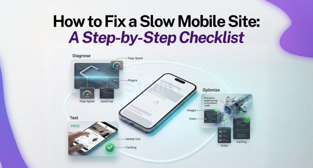
How to Fix a Slow Mobile Site: A Step-by-Step Checklist
Work through the steps below in order. Each step builds on the step before.
- Test your current mobile score with Google PageSpeed Insights and note your Largest Contentful Paint and Total Blocking Time.
- Compress and convert your images to WebP with a plugin like ShortPixel.
- Install a caching plugin and turn on JavaScript deferral and CSS minification.
- Audit your third party scripts in Chrome DevTools, under the Network tab, and delay anything not essential to the first few seconds of a visit.
- Fix font loading with font-display: swap and self-hosted font files.
- Confirm your viewport tag, ask your host about object caching, and check whether HTTP/2 runs on your domain.
- Re-test your mobile score and compare the new result against your first result.

Test With Real Visitors, Not Only Lab Scores
PageSpeed Insights gives you a lab score based on a simulated device. Your actual visitors carry real phones on real networks, and this data lives in a separate report inside Google Search Console called Core Web Vitals. The report pulls from the Chrome User Experience Report, built from real Chrome users who visited your site over the past 28 days.
Check this report before spending hours chasing a perfect lab score. A site rough in PageSpeed Insights sometimes performs fine for real visitors on modern phones with strong connections, while a site with a decent lab score still frustrates visitors on older Android devices, a group larger than most site owners assume.
Do Not Skip Mobile Usability
A fast page hard to use on a phone still loses visitors. Keep buttons and links at least 48 by 48 pixels so a thumb taps them without missing. Keep body text at 16 pixels or larger so nobody pinches and zooms to read a sentence. Store owners running WooCommerce should test the checkout flow with extra care. A slow or cramped mobile checkout costs sales directly, and the flow deserves a separate round of testing away from the rest of your pages.
A Five Minute Test to Run Right Now
Open Chrome DevTools on your desktop, switch to the Network tab, and set throttling to Slow 4G. Reload your homepage and watch how long text and images take to appear. The test will not replace a full mobile audit, but the test gives a rough sense of your real mobile experience in under five minutes, before installing a single plugin.
Where to Start Today
Fix your images first if today gives you only a few minutes. Work through the full checklist above with a longer stretch of free time. A WordPress site slow only on mobile fix rarely needs a new theme or a new host. The fix needs you to find the two or three specific settings dragging your phone experience down, then adjust the settings one at a time.

Founding Starlit Devs has allowed us to extend our expertise globally, serving over 500 clients, including Fortune 1000 companies, with custom web development services. Our commitment to delivering exceptional design and development is coupled with a deep understanding of SEO, which has been pivotal in empowering businesses to achieve maximum online engagement and brand growth. At Starlit Devs, we take pride in our mission to provide websites that stand out in a competitive digital landscape and drive tangible results for our clients.
