

You’re getting traffic. People land on your homepage, browse your products, maybe even toss something into their cart. And then… nothing. They leave. No purchase, no email, no second visit.
That gap between “visitor” and “customer” is almost never a traffic problem. It’s a user experience problem. And the fastest way to find it, instead of guessing, is to run an ecommerce UX audit.
If you’ve never done an ecommerce UX audit before, this guide walks through the whole thing: what it actually is, when you need one, how to run an ecommerce UX audit yourself page by page, and how to turn what you find into a report your team will actually act on. That last part gets skipped in most guides on this topic, and it’s the one that matters most.
What is an Ecommerce UX Audit?
An ecommerce UX audit is a structured review of your online store that finds the exact spots where shoppers get confused, hesitate, or give up. Instead of guessing why your conversion rate is stuck, you go through your store page by page, homepage, product pages, cart, checkout, and check each one against what’s known to actually work for online shoppers.
Think of an ecommerce UX audit like a checkup for your store. A doctor doesn’t just ask “Do you feel fine?” They check specific things: blood pressure, reflexes, and heart rate. A good ecommerce UX audit works the same way. You’re not asking “Does my store look okay?” You’re checking specific, answerable questions: Can someone find a product in three clicks or less? Does the checkout page show shipping costs before the final step? Is your “Add to Cart” button visible without scrolling?
A solid ecommerce UX audit usually blends two kinds of evidence:
- Expert review. Someone walks through your store like a first-time shopper, noting every place they hesitate, backtrack, or get stuck. This is often called a heuristic evaluation.
- Real user data. Analytics, session recordings, and heatmaps that show where actual visitors are dropping off, not where you assume they are.
Put those two together, and you stop guessing. You get a ranked list of what’s actually broken.

Why Bother With an Ecommerce UX Audit?
Every time a customer gets confused on your website, you lose money. A proper ecommerce UX audit finds these frustrating moments so you can fix them before your customers leave for a competitor. A common mistake store owners make is investing heavily in a visual redesign without fixing the underlying user journey first. An ecommerce ux audit ensures your strategy guides your design, removing friction and improving the overall shopping experience.
A few small fixes can move the needle more than you’d expect. Even a conversion bump from 2% to 2.5% can mean tens of thousands of dollars a year for a mid-size store, just from the traffic you already have.
Here’s what a solid ecommerce UX audit usually gets you:
- Fewer abandoned carts. Most cart abandonment comes down to confusion or surprise costs, not people changing their minds.
- Higher conversion rates. Less friction, fewer reasons to bail before paying.
- Better mobile performance. Mobile shoppers convert lower than desktop almost everywhere, and an ecommerce UX audit usually surfaces exactly why.
- A prioritised to-do list. Instead of fifty vague “improve the UX” notes, you get a ranked list of what to fix first.
- Proof for your team. It’s much easier to get a developer’s time when you can point to a specific issue from your ecommerce UX audit (“checkout drops 18% of mobile users at the shipping step”) instead of a hunch.
When Should You Run an ecommerce UX Audit?
How do you know if your store is struggling? There are several warning signs indicating that it is time to perform an ecommerce ux audit.
- High traffic, low sales: You are getting visitors, but your conversion rate is sitting below average, or you are seeing stagnant user engagement, like short session times and low page views. This is a prime indicator that an ecommerce ux audit is necessary.
- Customer support is overwhelmed: If your team is constantly answering basic questions like “Where is your return policy?” or “How do I track my order?”, your site is not intuitive. An ecommerce ux audit will identify why users cannot find this information themselves.
- You just expanded rapidly: If you recently added new categories, filters, or checkout features on the fly, your user flow might have become inconsistent. You need an ecommerce ux audit to realign the experience and ensure rapid growth doesn’t break usability.
- Mobile sales are lagging: Most of your traffic comes from phones, but mobile users are converting at a much lower rate than desktop users. An ecommerce ux audit will pinpoint where the mobile version of your site falls short, ensuring touch targets and menus are optimized.
- Your design is old: If your design is more than three years old, user expectations have likely outgrown it, making an ecommerce ux audit a necessity to catch up with modern standards.

How to Run an Ecommerce UX Audit, Step by Step
Here’s the process in plain terms, no specialist jargon required.
- Set a clear goal. Don’t start your ecommerce UX audit with “improve UX.” Start with something specific: reduce cart abandonment, improve mobile checkout completion, and increase product page conversion. A clear goal tells you which pages to focus on first.
- Pull your data first. Before you start clicking around, check your analytics. Where in the funnel do people drop off hardest? Which device underperforms? Which pages get traffic but low conversion? This tells you where to focus your ecommerce UX audit instead of treating every page equally.
- Watch real sessions. Tools like Microsoft Clarity or Hotjar (both have free tiers) let you watch recordings of real visitors using your site. Watch 20 to 30 sessions on your weakest pages. You’ll see things no spreadsheet will show you: someone rage-clicking a broken filter, someone scrolling past your “Add to Cart” button three times looking for it.
- Do the walkthrough. Now go through your store like a first-time customer, on both desktop and mobile. Try to actually buy something. Note every spot where you hesitate, get confused, or have to think harder than you should. Screenshot everything; this is the heart of any ecommerce UX audit.
- Check against known best practices. This is where most ecommerce UX audit guides point you to research from places like the Baymard Institute or Nielsen Norman Group. You don’t need to memorize hundreds of guidelines, just check your store against the page-by-page list below.
- Write it up and prioritize. Don’t hand your team a giant list of 60 issues with no order. Rank everything by impact versus effort, and lead with the handful of fixes that will move the needle fastest.

The Ecommerce UX Audit Checklist, Page by Page
This is the part most people are really here for. Go through each section of your ecommerce UX audit on your own store.
Homepage
- Can a new visitor tell what you sell and why they should care within a few seconds?
- Is there one clear, obvious next step (a “Shop Now” or category link) above the fold?
- Do trust signals (reviews, security badges, “as seen in” logos) show up early?
- Does your main menu have a manageable number of categories, not 20 confusing ones?
- Does the page load fast? Slow homepages quietly kill conversions before anyone even sees your products.
Category and Product Listing Pages
- Do filters actually work, and do they update results without a full page reload?
- Is there a helpful fallback when a filter combination returns zero results, instead of a dead end?
- Can shoppers sort by price, rating, or newest?
- Do product cards show enough info (image, price, rating) to judge interest without clicking in?
- Does it work just as well on mobile, with filters in an easy-to-reach drawer instead of being buried?
Product Pages
- Multiple high-quality images, ideally from different angles?
- Clear, scannable descriptions, not a wall of text?
- Is the price easy to spot, not buried in small grey text?
- Are reviews and ratings visible without scrolling far?
- Is “Add to Cart” the most visually obvious button on the page?
- Is shipping and return info visible before someone has to dig for them?
Cart Page
- Can people change quantities or remove items without the page fully reloading?
- Are all costs (subtotal, shipping, taxes) shown clearly before checkout, not as a surprise later?
- Is “Proceed to Checkout” impossible to miss?
- Is guest checkout clearly available, not hidden behind a forced signup?
Checkout
- How many steps does it take? Anything beyond 3 to 4 steps loses people.
- Are there social logins or autofill to skip retyping addresses and cards?
- Does it work cleanly on a phone, with the right keyboard popping up for each field (numeric for cards, email for email)?
- Are there trust signals (security badges, accepted payment logos) right where people are about to pay?
- Are error messages specific (“card number is invalid”) instead of vague (“something went wrong”)?
Post-Purchase
This page tends to get skipped in most ecommerce UX audit checklists, but it matters more than people think.
- Does the confirmation page clearly show an order number and what happens next?
- Is there a simple way to track the order or contact support?
- Is there a light, non-pushy nudge to create an account or join a loyalty program?

How to Write an Ecommerce UX Audit Report (So It Actually Gets Used)
This is the part almost every ecommerce UX audit guide leaves out, and it’s the difference between an audit that sits in a folder and one that actually changes your store.
A report that gets ignored usually looks like a 40-page document with no clear order. A report that gets used usually has three parts:
- A summary up top. Two or three sentences: what you found in your ecommerce UX audit, what it’s likely costing you, and what to fix first. Busy stakeholders read this part and nothing else, so make it count.
- Issues ranked by impact, not by page order. For each issue: what’s wrong, why it matters, a rough fix, and how hard the fix is to build. A simple “high impact, low effort” issue should sit at the top of the list, even if it’s a small thing like a missing trust badge.
- Screenshots, not just descriptions. Annotate the actual screen where the problem lives. “The checkout button is below the fold on mobile” is fine. A screenshot with an arrow pointing at it is faster for a developer to act on.
If you only do one thing differently after reading this, make it that: rank by impact and effort, not by which page comes first in the site map.

Tools You Need for an Ecommerce UX Audit
You don’t need an expensive toolkit to run a solid ecommerce UX audit:
- Google Analytics 4 for funnel drop-off and traffic data, which you almost certainly already have.
- Microsoft Clarity (free) or Hotjar for session recordings and heatmaps.
- PageSpeed Insights to check how fast your key pages load on mobile.
- A spreadsheet or Figma board to organize and prioritize your findings; nothing fancier is required for a useful ecommerce UX audit.
Should You Run Your Own Ecommerce UX Audit or Hire Someone?
If your store is newer or smaller, doing your own ecommerce UX audit with the checklist above is a completely reasonable place to start. It costs nothing but time, and it’ll catch most of the obvious problems.
Hiring a specialist to run your ecommerce UX audit makes more sense once your store has steady traffic and a conversion rate that’s stuck below where it should be. A second pair of trained eyes will usually catch things you’ve stopped noticing simply because you look at your own site every day. Either way works; the goal of an ecommerce UX audit is the same regardless of who runs it: find what’s actually stopping people from buying, then fix it in order of impact.
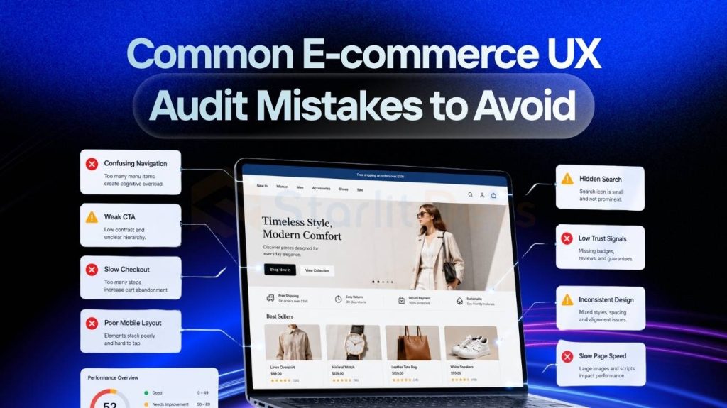
Common Ecommerce UX Audit Mistakes to Avoid
- Auditing everything at once. Pick your highest-traffic, lowest-converting pages first. You don’t need to perfect every corner of the site in one pass.
- Skipping mobile. Most ecommerce traffic is mobile, and mobile-specific problems (small tap targets, broken keyboards, slow loads) are some of the easiest wins.
- No follow-up. An ecommerce UX audit with no action plan is just a list of complaints. Set a date to revisit and measure what changed.
- Ignoring small annoyances. Tiny friction points add up across thousands of visitors into real lost revenue.
How Much Does an ecommerce UX Audit Cost and What is the ROI?
Pricing for an ecommerce ux audit varies wildly depending on who you hire and how deep they look. Before paying anyone, you should run a quick calculation to see if an ecommerce ux audit is worth it. Calculate your monthly sessions multiplied by a conservative conversion rate increase, multiplied by your average order value. If the projected revenue gain pays back the cost of the ecommerce ux audit within 90 days, it is a smart investment.
Here is a realistic breakdown of what an ecommerce ux audit might cost you:
- The DIY Route (USD 0): You can do a basic ecommerce ux audit yourself using free analytics tools and online checklists. This is a great starting point if your store is new and makes under USD 300,000 a year. However, a DIY ecommerce ux audit means you will lack industry benchmark data and bring your own blind spots to the review.
- Freelance auditors (USD 500 – USD 4,000): You can hire an independent expert to run a solid ecommerce ux audit. Just make sure their portfolio proves they have specific ecommerce experience. A cheap ecommerce ux audit often misses critical things like mobile testing and session recordings.
- Specialist ecommerce studios (USD 2,500 – USD 15,000): This is the sweet spot for a highly detailed ecommerce ux audit. Specialists use a documented, repeatable framework calibrated to ecommerce, utilizing advanced data analysis and providing developer-ready solutions.
- Large digital agencies (USD 10,000 – USD 50,000+): For massive corporate retail brands doing over €20 million in revenue, an ecommerce ux audit might include a whole team of strategists, boardroom presentations, and heavy project management.

FAQ
1. How often should I run an ecommerce UX audit?
Once or twice a year for most stores, or right before a redesign so you know what’s actually broken before you rebuild it.
2. How long does an ecommerce UX audit take?
A DIY ecommerce UX audit can take a few hours to a couple of days. A professional, data-backed ecommerce UX audit typically takes one to two weeks.
3. How much does an ecommerce UX audit cost?
A DIY version costs nothing but your time. Hiring someone ranges from a few hundred dollars for a freelancer to several thousand for a specialist studio.
4. What's the difference between an ecommerce UX audit and usability testing?
An ecommerce UX audit checks your store against known best practices and real analytics data. Usability testing watches actual people try to complete tasks on your site in real time. They work well together, but an audit is usually the faster, cheaper place to start.
Wrapping Up
An ecommerce UX audit isn’t a one-time chore you check off and forget. It’s a habit. Run an ecommerce UX audit once or twice a year, and you’ll keep catching small problems before they turn into real revenue loss. Start with your weakest page, work through the checklist above, watch a handful of real sessions, and write up what you find in a way your team can actually act on. That’s really all an ecommerce UX audit is: a structured way of seeing your store the way your customers do, instead of the way you’re used to seeing it.

Founding Starlit Devs has allowed us to extend our expertise globally, serving over 500 clients, including Fortune 1000 companies, with custom web development services. Our commitment to delivering exceptional design and development is coupled with a deep understanding of SEO, which has been pivotal in empowering businesses to achieve maximum online engagement and brand growth. At Starlit Devs, we take pride in our mission to provide websites that stand out in a competitive digital landscape and drive tangible results for our clients.
- Mahfuz M
